

UI vs. UX: The Trouble with Transparency
Transparency is pretty... just keep it out of my UI.
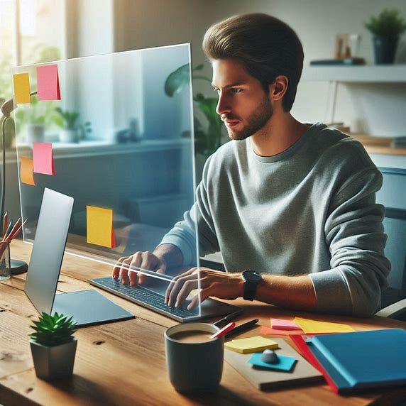
Being a nerd, I love gadgets and toys. I also love to cook… and my love of gadgets finds no better home that in a kitchen supply store. I remember purchasing a beautiful mandolin… All chrome and lots of blades and gadgets… and all in a hefty black case to keep it all together. It was beautiful.
The problem is that I placed beauty above usability. I loved the shiny and the toys and thought they'd come in useful someday. It didn't occur to me that the entire process of getting out the case, setting the mandolin up for use, finding the right blade, would be so annoying that I'd avoid using it. There's very little you can do with a mandolin that you can't do with a knife… and the knife is right next to you, ready to be used. I never used the mandolin.
Transparent interfaces are similar in both their beauty and uselessness.
I believe human eyesight differentiates objects based on three fundamental characteristics: Lighting, Distance, and Motion. Lighting is broad as it includes color, shape, texture, dimensions… anything that you might use to describe an object that is the result of lighting. Distance is the result of our binocular vision and depth perception and depends on our two eyes seeing ever so slightly different images that our brains stitch together and translate into depth and distance. Motion is recognized because it creates identifiable changes in the image we're seeing that we can perceive.
This all works great in the real world because all three are generally present and therefore we're able to differentiate between objects fairly easily. What happens when you start taking these things away though? As we remove each of these aspects, it becomes much more difficult to differentiate between objects. Think about the Where's Waldo books. These books are a challenge because they remove these aspects. There is no motion, and the page is flat so there is no depth. There is lighting and color but the busyness of the images makes identifying Waldo very, very difficult.
Transparent interfaces suffer exactly the same issues. The display can create any lighting/color but in order to be usable, that color must at least moderately differentiate itself from the background… and with transparent displays that is no guarantee. Common technologies don't do depth; displays are flat and the images on them are all at the same distance. Motion is possible, but the idea of interactive interface elements bouncing around constantly would be more difficult than valuable.
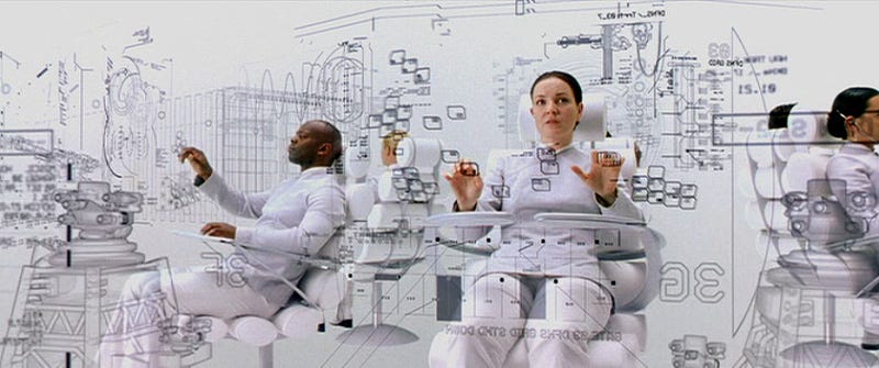
The Matrix Reloaded demonstrated a form of transparency when we descended into Zion. The gate operators were all sitting in front of a virtual, and essentially transparent, interface. While my nerd brain thought this was very cool, I could only imagine how exhausting such an interface might be to actually use. Monochromatic and able to see underlying objects through higher objects… things moving behind things that are static… it just feels exhausting.
And of course, here is where we get to Apple and Liquid Glass…
Supposedly, the Liquid Glass concept was pulled from the Vision Pro… Apple’s entry into the computing headset arena. Given the completely different way one interacts with the Vision Pro, a new interface makes sense… and Liquid Glass (though I’m sure if it was called that on its inception) works beautifully here.
Lighting - There is a risk that the UI elements are the of similar color and brightness, but the UI elements have an effect of glowing… they have an internal luminosity that allows them to be visuallly distinct from the real-world background that isn’t “glowing”.
Motion - While the Vision Pro’s interface elements are static, the background is constantly in motion as your head moves through space. The Vision Pro simply has the background in motion instead of the foreground UI elements providing that differentiation.
Depth - The Vision Pro actually does impersonate depth because it is able to show a slightly different image to each eye. Through two distrinct micro-LED displays, one for each eye, those slight differences can be perceived as depth and distance.
The Vision Pro meets all of the requirements for a relatively good interface. Unfortunately, this does not translate to flat displays such as monitors, phones, or smartwatches.
Lighting - If the area surrounding an inteface element is of similar color or brightness as the background it becomes incredibly difficult to identify as a distinct element… and in here, they all “glow”… so that is no longer a differentiator.
Motion - Most UI elements on our [non-Vision Pro] devices are relatively static. Buttons aren’t jumping around and text boxes aren’t shaking. There may be some kind of entry effect for these UI elements… but after that, most elements static, removing the visual cue that the element is active.
Depth - Common displays simply aren’t 3D and can’t provide a real sense of depth or distance. Everything on your screen is at exactly the same distance from your eyes. As opposed to the Vision Pro, there is only one image going to both of your eyes, so impersonating depth is simpy not possible.
Apple is seeing this issue and is actually backtracking. iOS 26 beta 2 to beta 3 demonstrates this. Beta 2 had high transparency for the UI elements such that they were difficult to differentiate and use. In beta 3 Apple is solving this by essentially “frosting” the backgrounds in areas of interactivity in the interface. This is an acknowledgement that a purely transparent UI simply doesn’t work. It doesn’t meet any of the requirements for solid visual differentiation.
Even if Apple is fixing the lighting issue through frosting, there is still no motion, and depth is impossible.
The only way to fix it is to break the glass.
Not even Apple, historic king of interface design and accessibility, isn’t perfect… and I feel in its current iteration glass is going to make things worse rather than better. It does however provide an opportunity for iOS 27 to be “innovative” as it hopefully abandons the Liquid Glass concept and gives us yet another interface. Hopefully better.